

Color
Color is an essential element of your company’s brand identity. Once you have a well-designed logo in black and white, the next vital addition to your brand package is to develop a limited color palette. Your color palette should contain no more than 5 colors.
I work very closely with my clients to establish a palette that best suits their company. It is also imperative that you like your color palette. You will see your logo and your colors every day. Your brand identity must reflect you and your business. The two are intertwined.
Not only must you and your company be considered but also your target audience when selecting your colors. For example, are you targeting men or women, young, middle-aged, or elder? What colors best reflect your industry? All these variables will play a role in selecting the ideal color palette for your company.
``
I work very closely with my clients to establish a palette that best suits their company
The colors in your palette must complement each other, whether they are vibrant, subdued, or monochromatic.
After some discussion with my clients, I search for colors based on their style. I always ask my clients if their company was a color, what color would it be? Frequently, clients have not considered their color selection in that creative manner.
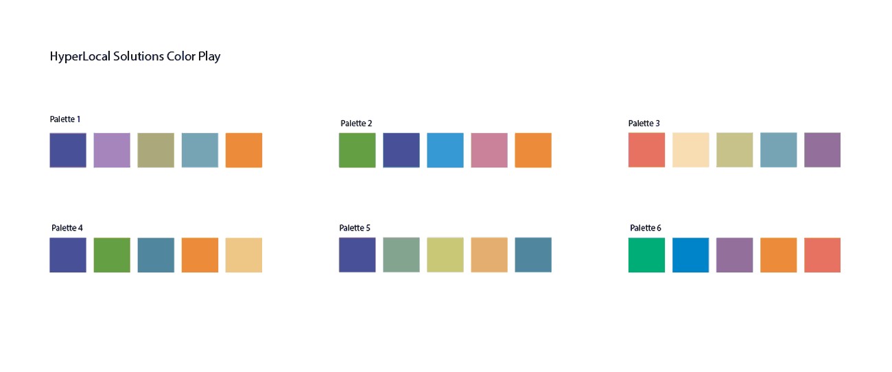
Once I have an idea of what you are looking for, I will submit multiple color palettes for you to choose from. The selection may seem overwhelming in some cases, but you will discover it is easy to narrow down the selection by eliminating palettes you don’t like.
Through the process of elimination, the client narrowed the options down to 2 possible winners.
After the client chooses a color palette, I present their new logo in color variations from their chosen palette.
The color palette is established.
I believe less is more, so I usually use only 2 to 3 colors in the logo. We will use the remaining colors in the palette as ascents for the web and other appropriate designs.
Stick to your palette religiously and consistently. Use each color in specific ways as part of your brand identity.
We have established your color palette. For this project, the client selected a color combination that was not my preferred version. My preference was number 1, using blue for the logo text. The client, however, preferred variation 2, using green for the text. The color mix the client prefers is always the winner. The logo must meet the client’s vision, not mine.
I will provide you with your logo in your selected colors and the color palette to help you maintain your brand identity when the project is completed.
View my projects to get a better idea of how I use color in your branding. If you are interested in starting a project for your company, feel free to call me @661-205-7691, or email me @paula@paulanichols.com